You know that feeling when your COUNT DISTINCT query has been running for three hours and your manager is breathing down your neck? Yeah, we've all been there. The thing is, nobody tells you in your first data engineering job that exact answers to simple questions can be impossibly expensive at scale.
I remember the first time I had to count unique users across a platform. "Just throw it into a GROUP BY", I thought. Two billion events later, my cluster was on fire and my query was still crunching numbers. That's when I hit the wall and had that uncomfortable realization: maybe the problem wasn't my framework, or the cluster size, or even the query. Maybe the problem was me insisting on an exact answer.
I started digging into how people handle this at a ridiculous scale. That rabbit hole leads you pretty quickly to probabilistic data structures. Bloom filters, HyperLogLog, Count-Min Sketch.
And that's what first led me to data sketches.
Turns out, data sketches actually deliver on what they promise: you trade exactness for speed, and in return you get answers that are fast, tiny, and mathematically bounded in how wrong they can be. Here's what nobody talks about though: they're also weird, counterintuitive, and require you to fundamentally change how you think about accuracy.
This is part one of a series on data sketches. Most of the examples and sketch types I'll cover throughout come from Apache DataSketches — the most production-ready open-source library for this stuff available, originally built at Yahoo.In this article, I'll walk through the fundamental problem, why traditional approaches fail at scale, and give you a comprehensive overview of the sketch landscape.
The Problem
Let's say you're running a successful internet company selling mobile apps and music. Your internal reporting system collects log data from two main sources: web servers (tracking page views, time spent, items browsed, etc) and a financial transaction system (recording purchases, processing credit cards, and handling authentication).
Two simple data sources. Billions of events per day because, hey, you're successful!
Then analytics comes knocking with questions that sound trivial, questions like:
- How many unique users viewed the Apps site over the last week?
- How many users visited both Apps AND Music?
- How many users visited Apps but NOT Music?
- What's the median and 95th percentile time spent on site?
- Can we get a frequency histogram of time spent values?
- What are the most popular items purchased?
- Which user ids generate the most revenue?
Sounds routine, right? Sure, but not at scale.
If you have experience answering queries like this with massive datasets, you already know the pain. And if you're currently trying to answer them, you're probably wondering why it takes so many resources and why computations run for hours or sometimes even days.
Why Exact Answers Are Impossibly Expensive
Computer scientists have known about these types of queries for a long time, but nobody paid much attention to them until the internet exploded and Big Data showed its true nature.
It's been mathematically proven (and it's intuitive once you think about it) that, to compute these queries exactly without making any assumptions about the input stream, you need to store a copy of every unique value you see.
Let that sink in.
To count unique visitors to a site with a billion users per day, your query process needs to have a billion records of all the unique visitors it's ever seen.
COUNT DISTINCT is not additive. Parallelism won't save you. You can't just add the count of ids from the Apps site to the count from the Music site unfortunately, because of duplicates – users who visited both.
💡 This is why
SELECT COUNT(DISTINCT user_id)in Spark is so painful. It triggers a full shuffle of the entire dataset across the cluster — every unique id has to land on the same executor to be counted. You can throw more machines at it, but you can't escape the shuffle.
Exact quantile computation is even worse. Not only does it need to store a copy of every element encountered, it needs to sort them all.
At a billion events per day, this isn't data engineering, this is masochism.
When Approximate is Better
Do you actually need ten digits of precision here? Because if an approximate answer is good enough, there are algorithms that answer these queries orders of magnitude faster.
Of course, this assumes you care about query speed and resource utilization. It also assumes that if you are able to accept approximation, you want to know something about the accuracy you're getting.
Sketches – the informal name for these algorithms – are often the right answer, and in some cases the only practical answer, for these types of queries.
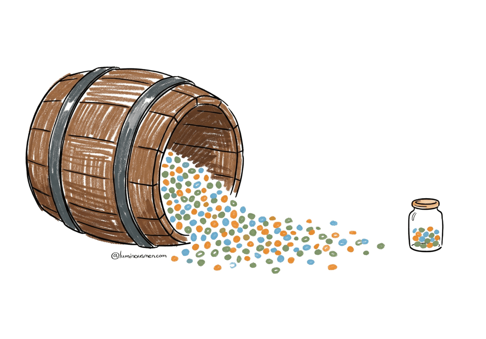
Instead of storing massive datasets, sketches use small data structures. These structures are typically kilobytes in size, which is orders of magnitude smaller than the memory required for exact solutions. Since sketches are also streaming algorithms, they only need to see each incoming element once.
Origins
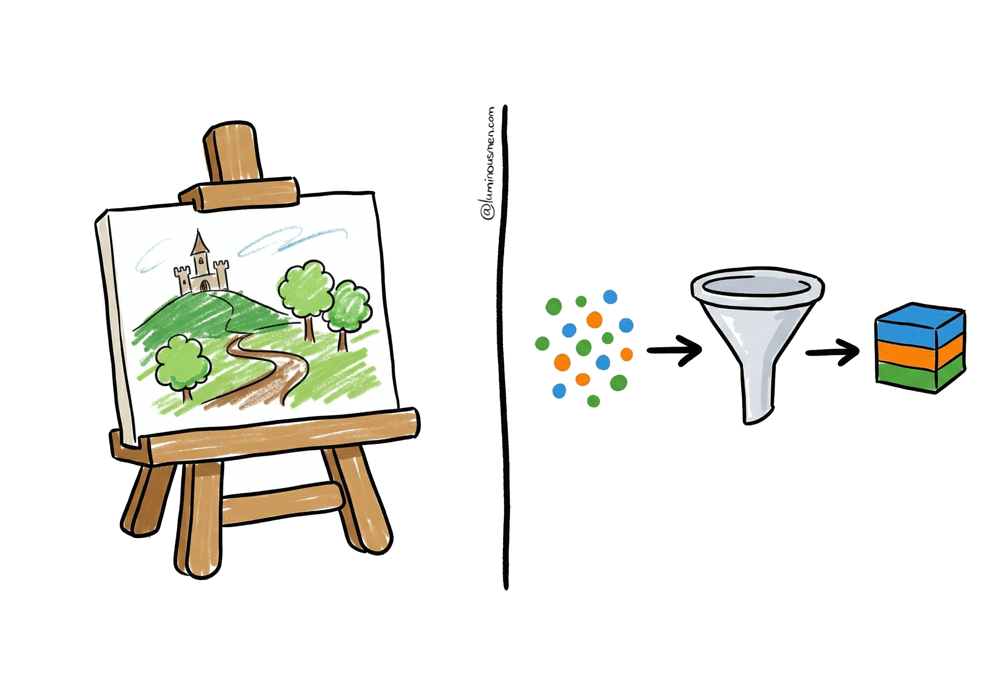
Sketching sits in a corner of computer science called Streaming Algorithms — algorithms that extract information from data in a single pass, seeing each element exactly once. The name "sketch" comes from the same idea as an artist's sketch: a rough approximation that captures the essential structure without filling in every detail.
The field mostly traces back to Philippe Flajolet, a French mathematician who in 1985 co-authored the paper "Probabilistic Counting Algorithms for Data Base Applications" — one of the earliest papers on the concept. Flajolet spent his career on analytic combinatorics and algorithm analysis — not exactly bedtime reading, but the practical payoff was enormous.
The key thing that separates sketches from regular sampling is that sketches look at everything. A 1% random sample ignores 99% of your data. A sketch processes every single element but discards most of what it sees, keeping only a compact summary. That's why the estimates are so good — and why they work on streams where you can't go back.
Think about a Kafka topic with clickstream data or a firehose of mobile events. You don't get to rewind and reprocess everything every time someone asks a new question. Storing the full dataset is often too expensive, and even if you do, re-scanning it kills latency.
Sketches solve this by turning the stream into a compact summary as it flows. You see each event once, update a tiny data structure, and move on.
💡 You're probably already using sketches without knowing it. Most major data systems ship with sketch-based approximation functions built in. Spark SQL's
approx_count_distinct()is HyperLogLog under the hood. BigQuery hasAPPROX_COUNT_DISTINCTandAPPROX_QUANTILES. Presto and Trino offerapprox_distinct()andapprox_percentile(). Druid and Pinot have native Apache DataSketches integration — you can store, query, and merge Theta and quantile sketches directly in SQL. If you're already on one of these systems, you can start experimenting today without touching an external library.
The Core Elements
Most sketches share the same basic anatomy.
Hash Everything First
For cardinality sketches (COUNT DISTINCT), you start by hashing each incoming value into a uniform random number between 0 and 1. This is non-negotiable — raw ids have all kinds of structure and bias. The hash strips that away and gives you something you can reason about statistically.
Keep a Small Subset of Hashes
The sketch's data structure holds a bounded set of hash values — say, the smallest 1024 values it's seen. The size has a fixed upper bound, which is what makes memory management predictable. Unlike sampling, you don't keep random elements; you keep the ones that tell you the most about the full distribution.
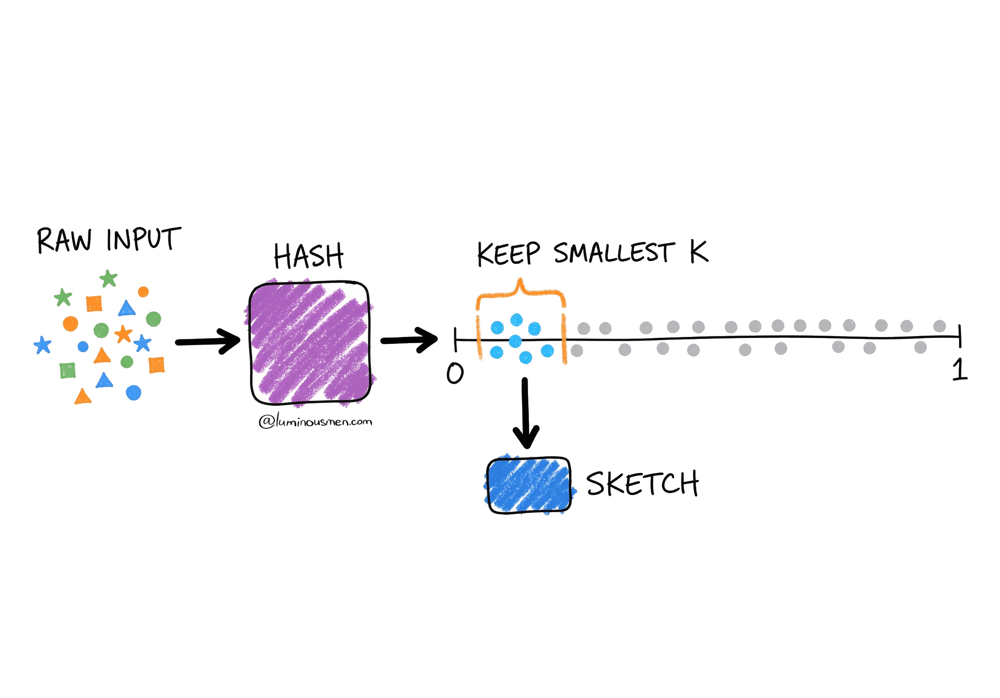
Estimate on Demand.
When you ask for a result, the estimator looks at what's in the data structure and does the math.
The key assumption is that your hash function produces values uniformly distributed between 0 and 1. Once that's true, something interesting happens: the smallest values you observe start carrying information about how many total items you've seen.
Think about it. If you've only seen 100 unique items, the chance of observing a hash as small as 0.0001 is tiny. But if you've seen millions of items, hitting very small values becomes inevitable.
Sketches exploit this using order statistics. Instead of keeping all hash values, you keep the k smallest ones. If the k-th smallest hash you've seen is v, you can estimate the total number of unique items as roughly k / v.
So, if you kept the smallest 1024 hash values and your current minimum is 0.001, you can estimate that you've seen roughly 1,024,000 unique items (1024 / 0.001 ≈ 1,024,000) — because if values as small as 0.001 are showing up, the space must be fairly densely populated.
The hash function has to be consistent — same input, same output, always — otherwise merging sketches from different machines breaks down.
The Part That Blew My Mind
The real breakthrough isn't just that sketches are small and fast. It's that they're mergeable.
Remember our Apps and Music site example? With traditional counting, you can't combine counts from different partitions without seeing duplicates. But with sketches, you absolutely can.
Say you have Sketch A from the Apps site traffic and Sketch B from Music. You can merge them, intersect them, subtract them, and the error bounds still hold. This changes everything about how you architect data systems.
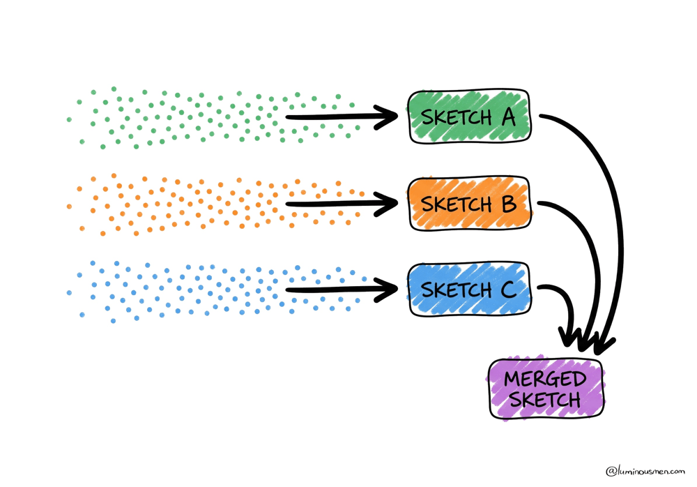
Suddenly, you can:
- Process your data in parallel across hundreds of machines, each building their own sketch, then merge at the end in milliseconds. Nobody waits on the slowest partition anymore.
- Pre-compute sketches at ingestion time and store them alongside your regular metrics. Your "unique users" column is now 2KB instead of 2GB, and it merges just like a SUM.
- Handle late-arriving data by updating existing sketches without reprocessing everything. Mobile data that shows up three days late? Just merge it in.
The architectural implications are massive. Instead of scanning raw data at query time, you build a hypercube of pre-computed sketches. Each cell contains aggregated metrics plus a sketch. When someone queries, you're just merging a few thousand small sketches, not scanning petabytes of logs.
The Sketch Family Tree
There's not just one kind of sketch either. Different problems need different algorithms with genuinely different trade-offs.
Here's how to think about the data sketch landscape (not every sketch variety – just the ones you likely find in production):
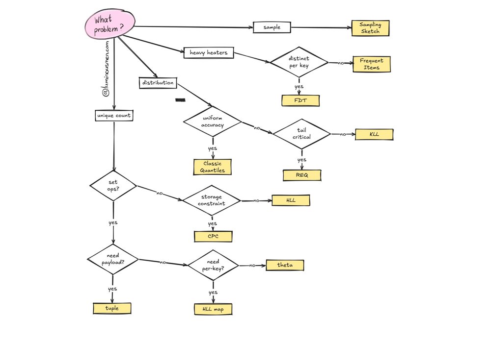
Cardinality Sketches: Counting Unique Things
This is the COUNT DISTINCT family. Most people start here.
Theta Sketches are what you reach for first when you need to answer questions like "how many users visited Apps but not Music?" The key differentiator is set expression capability: with Theta, you can compute arbitrary combinations — intersection, union, difference — and the error bounds still hold. A ∩ B, A ∪ B, A — B. This is why Theta is the most-used sketch in Apache DataSketches. It's fast, it supports concurrent updates for multi-threaded pipelines, and it's the right default when you're not sure which sketch to pick.
HyperLogLog gets you 2-16x smaller sketches for equivalent accuracy compared to Theta. That sounds great, but set intersection and difference aren't natively supported because the error compounds badly. If all you need is "how many unique users in total?" and you're merging sketches across machines, HLL is a solid choice. If you ever need to compute overlaps between populations, use Theta.
CPC (Compressed Probabilistic Counting) is what you use when you're storing millions of cardinality sketches and every byte matters. Kevin Lang built it to beat HLL on accuracy per stored byte, and it does — significantly. If you're pre-computing sketches across a high-cardinality dimensional cube and storage is a real concern, CPC is worth it.
HyperLogLog Map is very niche, but quite useful. Imagine tracking unique users per IP address across millions of IPs. Creating a separate sketch per key gets expensive fast. HLL Map is effectively an optimized hash-map of HLL sketches, designed for exactly this pattern — high-cardinality key spaces where you need per-key cardinality estimates without blowing up memory.
Tuple Sketches extend Theta for when you need more than a count. Sometimes you want to track unique users and their total revenue, or unique devices and their event counts. Tuple sketches let you attach arbitrary summary data to each unique identifier. They support the same set operations as Theta. Think of them as Theta sketches with a payload.
Quantiles Sketches: Understanding Distributions
While cardinality sketches answer "how many unique?", Quantiles sketches answer "what does the distribution look like?". A completely different problem.
Say you have a stream of page load times and you want the median, the 95th percentile, and the 99th. Or you want the full PMF to draw a histogram. Exact computation means storing every single value and sorting the whole thing — brutal at scale. Quantile sketches give you approximate answers to these types of questions with guaranteed error bounds from a single pass.
The Classic Quantiles Sketch is the production-tested original. The Apache DataSketches team publishes size tables showing that with k=256 — where k controls the accuracy vs memory trade-off — even 4 billion items compress to ~51KB.
Roughly speaking, increasing k gives you tighter error bounds at the cost of a larger sketch, while decreasing it makes the sketch smaller but less precise. The wild part is how far you can push this: tens of billions of data points summarized in a few dozen kilobytes.
That kind of compression is what makes it practical to store quantile sketches as columns in a data mart.
The KLL Sketch (Karnin, Lang, Liberty) achieves near-optimal size for a given accuracy target. If you're storing many quantile sketches and want the best size-to-accuracy ratio, KLL is the right default for most workloads.
The REQ Sketch (Relative Error Quantiles) is for tail-focused use cases. It gives very high accuracy at one end of the rank domain — very high percentiles or very low ones — at the cost of accuracy in the middle. If you're doing latency monitoring and care deeply about the 99.999th percentile but couldn't care less about the median, REQ is built for that.
Frequent Items Sketches: Finding Heavy Hitters
The heavy hitter problem: scan a stream and identify which items appear disproportionately often. A "Heavy Hitter" is any item consuming more than its fair share of the stream.
The Frequent Items Sketch handles the standard case: given a stream of items (error codes, song titles, user ids, IP addresses), find the ones that dominate. Frequency accumulates as the stream flows, so you get a running leaderboard.
The Frequent Distinct Tuples Sketch is where it gets genuinely interesting. Suppose you have a stream of {ip address, user id} pairs and you want to find IP addresses with the most distinct user ids — not the most raw occurrences, but the most unique ones. That's a different problem than simple frequency counting. FDT generalizes this to arbitrary dimensions: given a tuple with N dimensions, find combinations of M dimensions that have the most frequent distinct combinations of the remaining N-M dimensions. If that sentence made your head hurt, just know it's the right tool when "heavy hitter" and "cardinality per key" collide in the same query.
Sampling Sketches
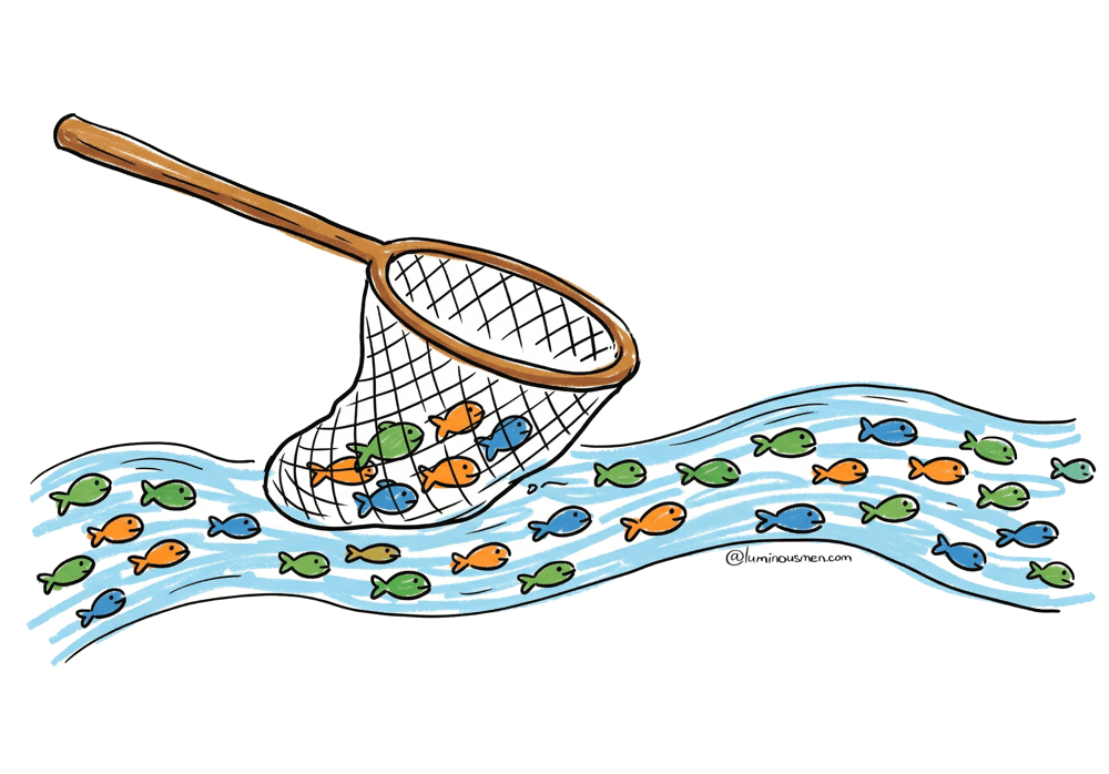
Sometimes you don't want statistics about a stream — you want an actual representative sample. Classic Reservoir sampling does this for a single machine. The sketch version adds the property distributed systems actually need: mergeability. You can build independent samples on different machines from disjoint partitions, then merge them into a single representative sample with correct statistical properties, even if the individual samples were different sizes.
Reservoir sampling works like a net — you can't keep every fish, but you can keep a representative catch.
The Trade-offs
I'd be lying if I said sketches are perfect. There are sharp edges, and I've cut myself on most of them.
Your Stakeholders Will Hate This
Approximate answers are a hard sell. Some people will straight up refuse — they'll demand exact counts, full stop. You can explain error bounds all you want. Some will never come around.
What actually worked for me: run sketches in parallel with exact counts for a few weeks, then show the results side by side. When they see the sketch says "1,247,892,000, +- 25,000 users" and the exact count is 1,247,893,421, they'll start to get it. Especially when the sketch result came back in 100ms and the exact count took 45 minutes.
That said — there are places where approximation is genuinely wrong. Financial reporting, billing, compliance. Auditors will not accept "approximately 1.2 billion dollars". For anything that touches money or regulation, use exact counts. Sketches are for analytics, not for checks.
The More Set Operations You Stack, the Worse it Gets
Every set operation adds error. Merging two sketches is fine. Intersect ten of them though, and you're compounding uncertainty in ways that can matter. A ∩ B ∩ C ∩ D ∩ E will have noticeably larger error than just A ∪ B. The bounds are still mathematically known, but keep an eye on how deep your expression trees go.
Sizing is an Art
Sketch size controls the accuracy-vs-memory trade-off. Too small and your error bounds get embarrassingly wide. Too large and you're burning memory and network for marginal gains. Most libraries default to something reasonable (e.g. 4096 entries is common for Theta Sketches) but for high-stakes use cases you'll want to tune it. DataSketches has accuracy calculators to help.
No Going Backwards
Once you've built a sketch, you can't un-sketch it. A sketch tells you "approximately 50,000 unique users" but not which users. If you built a sketch at daily granularity, you can't later extract hourly patterns. Sketched by country? You can't break it down by city after the fact.
Design your dimensional schema before you commit.
💡 Keep raw event data with a retention window alongside your sketches. If you change your dimensional schema, realize you sketched at the wrong granularity, or need to backfill a new dimension, you need something to rebuild from. Sketches are your fast query layer, not your source of truth. I guess it's just universal DE wisdom to save raw data just in case.
Storage Adds Up Faster Than You'd Think
While sketches are small relative to raw data, they're not free. The catch is multiplicative explosion: every dimension you pre-aggregate on creates another set of sketches.
If you sketch by page, country, and day, you're not storing "a sketch" — you're storing one sketch per page x country x day combination. That number grows fast.
A Theta sketch might be 32KB. But if you're working with unique users across 1000 pages x 100 countries x 365 days, that's 36.5 million sketches x 32KB = over a terabyte of sketch storage. Plan for it.
On the serialization side: sketches have two forms. Compact representations are smaller but frozen — you can't add new data. Updatable representations are larger but accept new updates. Pick based on whether you're querying or still ingesting.
💡 Sketch binary formats are not interchangeable between systems. Druid's built-in HLL format is a different binary layout than Apache DataSketches HLL. If you build sketches with the DataSketches library and try to read them natively in Druid, you'll get garbage. The same applies to Pinot and other systems with their own sketch implementations.
Where Sketches Don't Work
Sketches aren't magic, unfortunately. Sketches are a tool for a specific class of problem. They're not a drop-in replacement for exact computation everywhere.
If your data is small — say, under a million events — just count it exactly. The overhead of sketching isn't worth it, and your exact query probably completes in under a second anyway. The same logic applies to low-cardinality scenarios: if you have 200 unique users, a sketch's error bounds can be wider than the number itself.
If you need the actual values rather than statistics about them, sketches can't help you. A sketch tells you "approximately 50,000 unique users" — it cannot tell you which users. If you need to export user ids, do joins, or match individual records across datasets, you need the raw data.
And as I mentioned in the gotchas — anything financial, regulatory, or compliance-related is off limits. Auditors don't care about error bounds.
The Future is Probabilistic
The question isn't really "should we use sketches?" It's "where is exact precision actually required, and where are we just paying for it out of habit?"
Most analytics don't need exact answers down to the last digit. And most stakeholders, once they see the trade-off, won't miss that precision — especially when the alternative is waiting 45 minutes for a number that's "technically correct".
We've been trained to default to exactness. At scale, that default stops making sense.
Materials
- Apache DataSketches documentation
- Philippe Flajolet and G. Nigel Martin's 1985 paper "Probabilistic Counting Algorithms for Data Base Applications"
- Frequent Directions: Simple and deterministic Matrix Sketching
- Graham Cormode's "Synopses for Massive Data: Samples, Histograms, Wavelets, Sketches"
- Rinberg et al paper "Fast Concurrent Data Sketches"
- LinkedIn Engineering's blog post "Pinot and Theta Sketches"